Nebula Media’s Top 10
Tips on Marketing
Website Design
Performance based Web Design Philosophy
You’re investing valuable time and resources to get potential customers to your landing page. But how effective is it at converting them into leads through calls, emails, or web forms — or better yet — turning them into sales? Even the best marketers can improve the conversion rates on their landing pages, and this guide will help you do just that.
You want more customers.
A conversion-optimised landing page can
help you get them.
A conversion-optimised landing page can
help you get them.
Your potential customers come to your site after seeing your marketing or advertising. When they get to your landing page, you have less than 10 seconds to convince them to do business with you.
Marketing & Advertising
Drive a consumer to your business through search or display advertising , social media marketing, TV/ radio ads,etc
Acquisition
You’ve gotten a potential customer to your landing page and have less than 10 seconds to impress them. NOW What?

Conversion
Convince the visitor to take action like calling,emailing, or completing a from, which turns then into a lead for your business
That’s why your landing page must make it as easy as possible for a prospect to convert, or take a specific action, such as calling, emailing, or submitting a form.
Think of your landing page as a map to your business. You want to give a prospect a specific destination, clear directions, and a quick route that’s free of roadblocks. That’s why having a conversion-friendly landing page is so critical to your business – to provide the most direct, easy-to-follow path for a consumer to do business with you.
In this ebook, we cover 10 essential landing page tips to help you boost conversions on your website. And, we provide casestudies from two ReachLocal clients who have made these changes and dramatically improved their conversions.
1. Emphasize the Desired Conversion Path
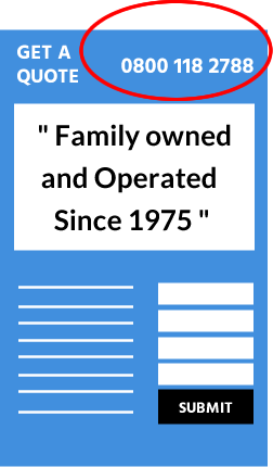
To get more customers to call you, make sure your phone number — your primary conversion path — is the most prominent thing on your landing page! But, in case a potential customer can’t call you, a secondary conversion path such as an email or contact form helps make it as easy as possible for them to convert.
Do This
Feature your phone number at the top of your landing page to give prospects a shortcut to doing business with you. Make it big, bold, and easy to read, so there’s no way they can miss it. Include at least one additional conversion method, so you have multiple ways to turn a visitor into a lead.
2. State Your Call to Action
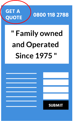
Your call to action (CTA) instructs a visitor to take a specific action. So, write a simple, clear phrase that tells your visitors exactly what you want them to do, like “Call Now for a Free Quote.”
Do This
Position your primary call to action at the top of the page so it’s one of the first things a visitor sees. Because your call to action is a component of your conversion path, you’ll want to incorporate it seamlessly with your phone number or other method, so these elements work together to clearly direct your prospects to contact you.
3. Make Your Value Proposition Pop
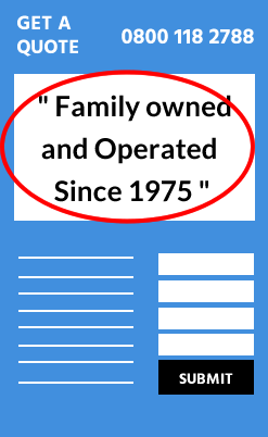
Communicate the main benefit of your business with a key value proposition at the top of your landing page, so the visitor can easily identify what your business does. Your value proposition should also correspond with the marketing that’s driving traffic to your site to ensure a consistent visitor experience. If you’re running pay-per-click advertising, the content on your page must be aligned to your text ad to positively impact your search engine quality score.
Do This
Write a catchy, succinct tagline or headline that clearly communicates your primary benefit or offer for both your landing page and your ads. Examples like “Family Owned and Operated Since 1975,” “Fixing Cars Since 1980” or “Voted Best Salon in Philadelphia” communicate what the business does as well as the value they provide to a potential customer.
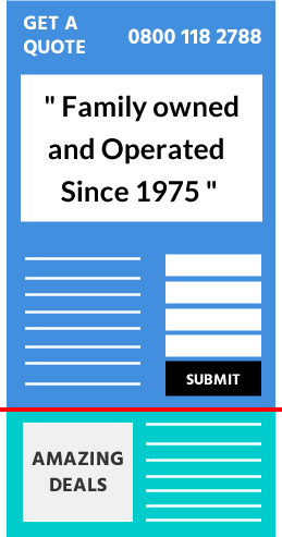
4. Move Important Information Above the Fold
The area of your website that a visitor sees without having to scroll is known as the area “above the fold.” Having key information, like your contact information, location, or service area, front and center for every visitor means they don’t have search for the information they need from you and enables them to quickly and easily find a way to convert. In fact, research shows that only 22%1 of consumers scroll to the bottom of a page — that’s almost 80% of your visitors who are missing key information if you put it below the fold.
Do This
Move your phone number, call to action, and fundamental details about your business and offers above the page fold. Make sure it looks good in every browser — not just in Internet Explorer, but in others like Google Chrome, Mozilla Firefox, and Apple Safari — as well as on various sized screens, so every visitor has an optimal experience.

5. Provide Alternate Routes
You need a secondary conversion method for visitors who don’t pick up the phone to call you. One way to do this is with a contact form, either directly on your landing page or on another page within your site. Additionally, live chat enables you to easily and affordably capture visitors’ key contact information and areas of interest as soon as they arrive at your site.
Do This
Add a contact form to capture leads from your landing page. For more flexibility and additional conversions, also add a live chat solution — and make sure someone is available to respond to incoming chats to ensure a smooth user experience. And remember, for every contact method you provide, you must assess the quality of the leads it delivers and follow up with prospects in a timely manner to close the sale. In fact, research shows that the sooner you follow up on a lead, the more likely you are to generate a sale. One study showed that after the first hour, your odds of reaching a new sales lead drop over 10x2.
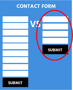
6. Shorten Contact Forms
Adding a form for visitors to contact your business, request a quote or appointment, or download educational content is a great way to capture leads from site visitors. Many site visitors may not be able to call because they’re at work, so this helps you capture leads from people who don’t want to call. But, the longer your form, the more friction you add to the conversion process. A Marketo study confirmed that a 5-field form received higher conversion rates than longer forms3.
Do This
Only include as many fields on your form as you need to qualify and contact the lead, such as their name, email address, and phone number. Design your form to flow from top-to-bottom, not side-to-side, and use a soft call to action on your submit button, like “Continue,” instead of a strong statement like “Join Now.” This implies less commitment to the visitor, so they are more likely to follow through with submitting the form.
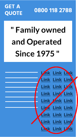
7. Steer Clear of Distracting Links
Your landing page has a lot of responsibilities, and sometimes that means helping visitors navigate to other parts of your site, like a Product or About page. But having too many links on your landing page can distract a potential customer from seeing the information you really want them to see – your conversion paths.
Do This
Remove or de-emphasize any unnecessary navigation and links from your landing page that can prevent visitors from converting. Include your primary call to action and phone number at the top of every internal page, so prospects can still contact you no matter where they are on your site.
8. Utilize a Simple Design
Your website is essentially your digital storefront, and the way you present yourself online can speak volumes. An amateur website design may communicate to your potential customers an unprofessional image of your business, causing them to leave your page without converting. On the other hand, a well-designed site communicates confidence, professionalism, and success – elements that appeal to potential customers when they’re researching businesses online.
Do This
Focus on a few key updates like simplifying your color scheme, adding professional images, and organizing the content on the page into a visually appealing format. If you really want your page to stand out, hire a professional website designer with knowledge of conversion best practices. See examples in appendix.
Simple color scheme
Professional images
Organised content
9. Cut Down on Copy
Another part of a great design is the copy on the page. It should only contain enough text to communicate key messages and direct visitors to your primary conversion path. Too much copy can slow down the conversion process and prevent prospects from easily and quickly finding the information they need. But, too little copy can mean you’re not providing enough information for a prospect to convert, so it’s important to strike just the right balance.
Simple color scheme
Professional images
Organised content
Do This
Prioritize copy by what is relevant to helping a potential customer convert, like your value proposition or a special offer. Any offers or key messages should align to your online marketing, so your page maintains relevance with both prospects and search engines. Break the copy up into small, skimmable chunks using headlines or bullet points, and move additional information about your business to another area of your site, such as an About or Product page.
10. Convey Trust and Authenticity
Displaying your business logo, customer testimonials, press quotes, and badges from industry accreditations, trade associations, and local awards or memberships on your landing page establishes brand credibility. In addition, authentic photos and videos of yourbusiness and employees can instill confidence in potential customers and encourage them to do business with you. In fact, video and pictures of your business differentiates you and showcases what you do. Plus, video can lengthen a visitor’s time on your page and increase their likelihood to convert4.
Do This
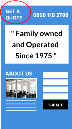
Use real photos of your employees, products, or services, rather than generic stock photography, or shoot a video that brings your business to life, such as a tour of your business or a demonstration of a popular product. In addition, highlight key trust indicators, like customer testimonials, badges, and awards, on the footer or sidebar of your landing page, and hyperlink them to another page on your site where visitors can get additional details.
about us
Nebula Media is a full service digital agency based in London. We specialise in Web Design, Online Advertising and Search Marketing.
We have helped hundreds of businesses to achieve their Growth Targets. We listen to each individual client, taking note of their unique situation and we create a bespoke solution to deliver amazing results.
you’re in safe hands


